
Resources
Brand Assets
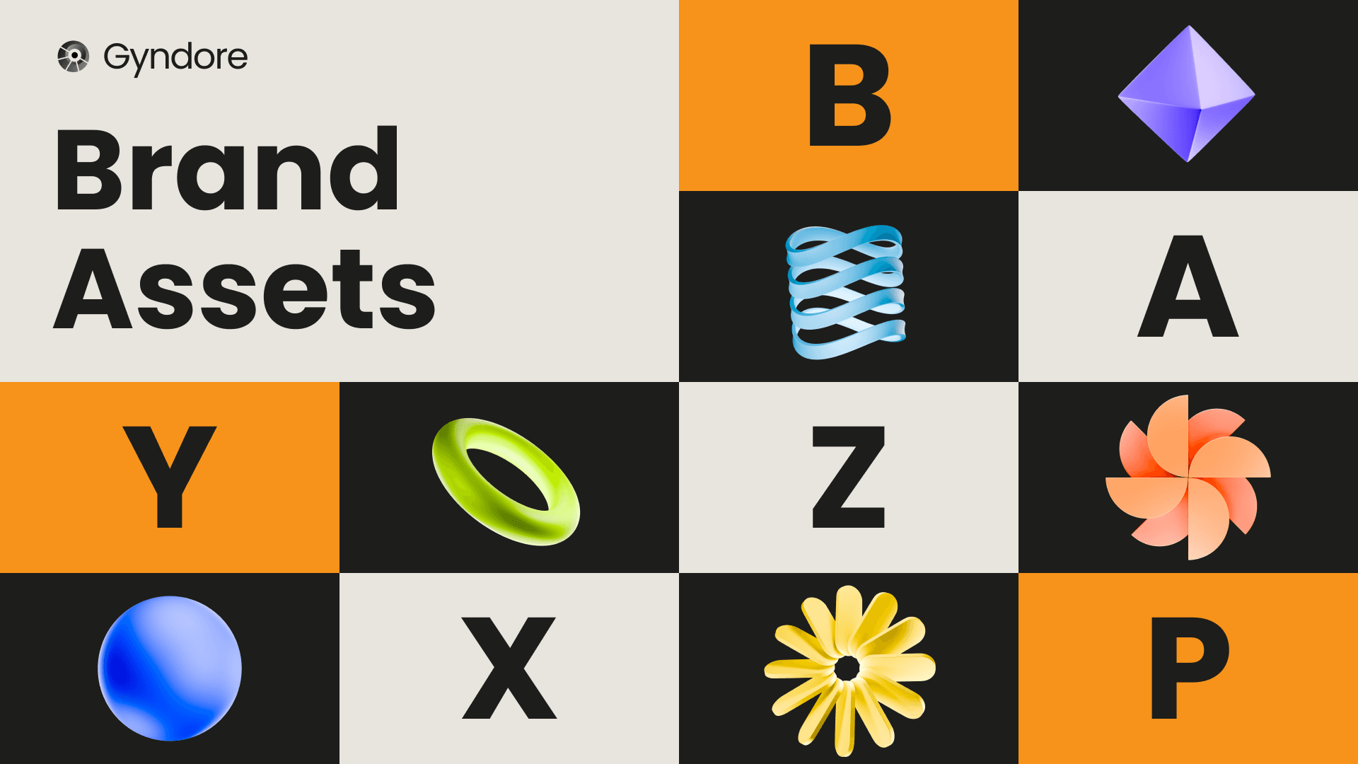
Logos, colors, token art, and banners, with the naming and usage rules that go with them. Take what you need to write about or build with Gyndore.
The name
The protocol is Gyndore. Always capitalize the G. Never write the name in all caps or all lowercase. The tagline is “Less noise, more sats.”
For a one-line description, Gyndore is the Bitcoin liquidity hub of Base: a stablecoin protocol, a concentrated-liquidity DEX, and a yield platform running as one system. Write “of Base,” not “for Base.”
Logo
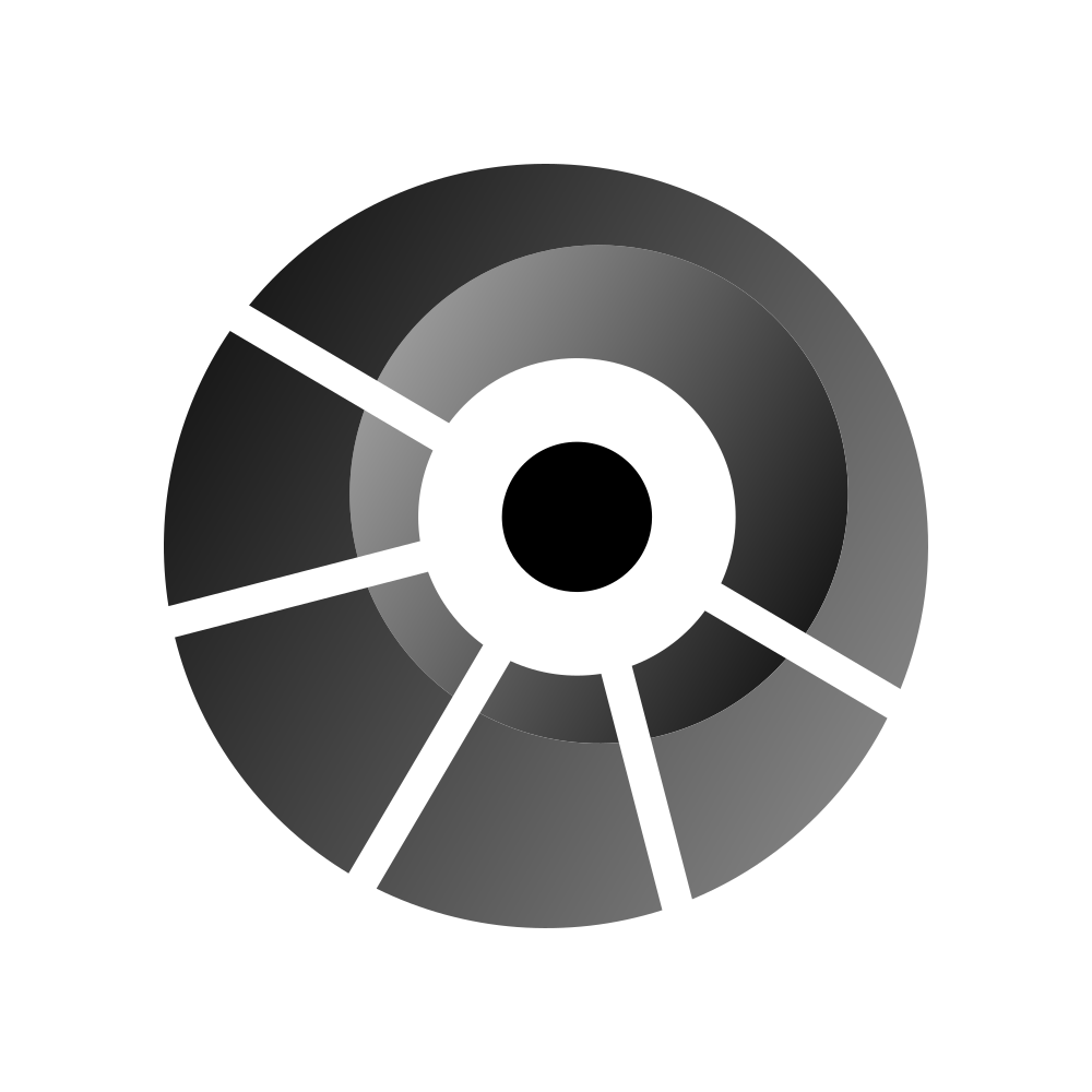
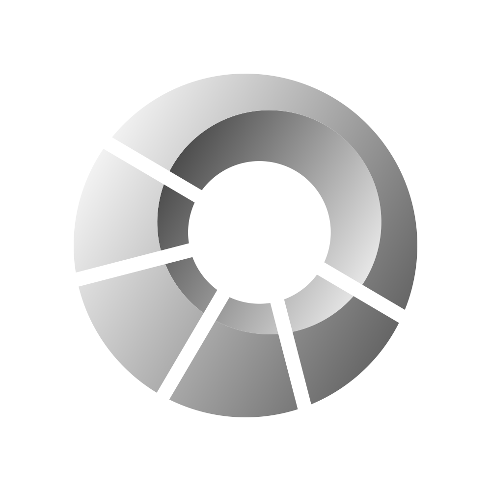
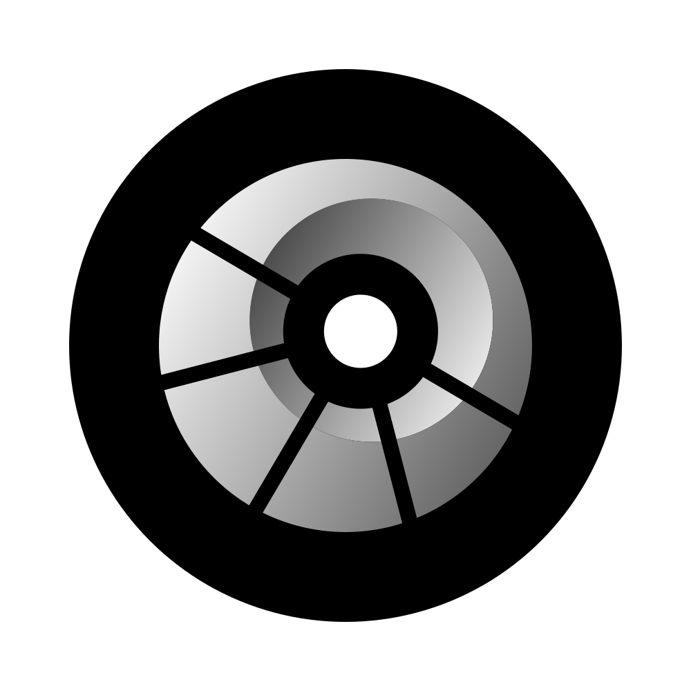
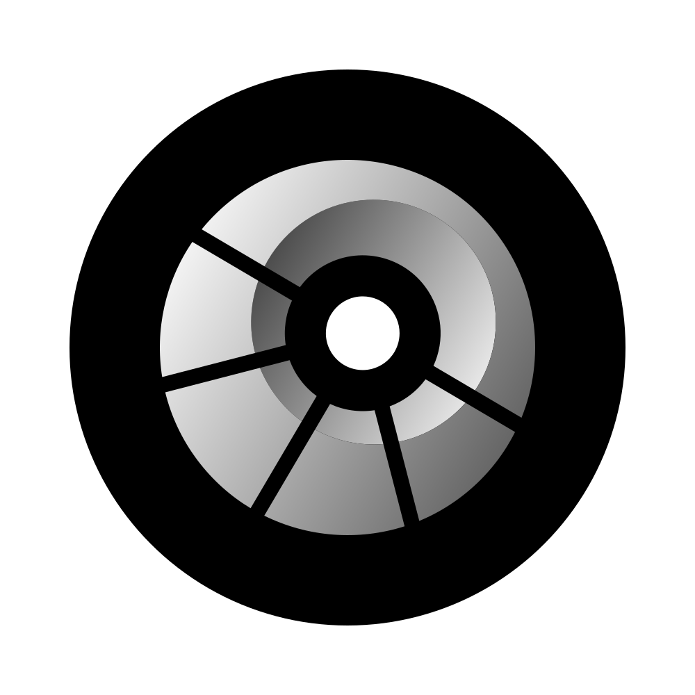
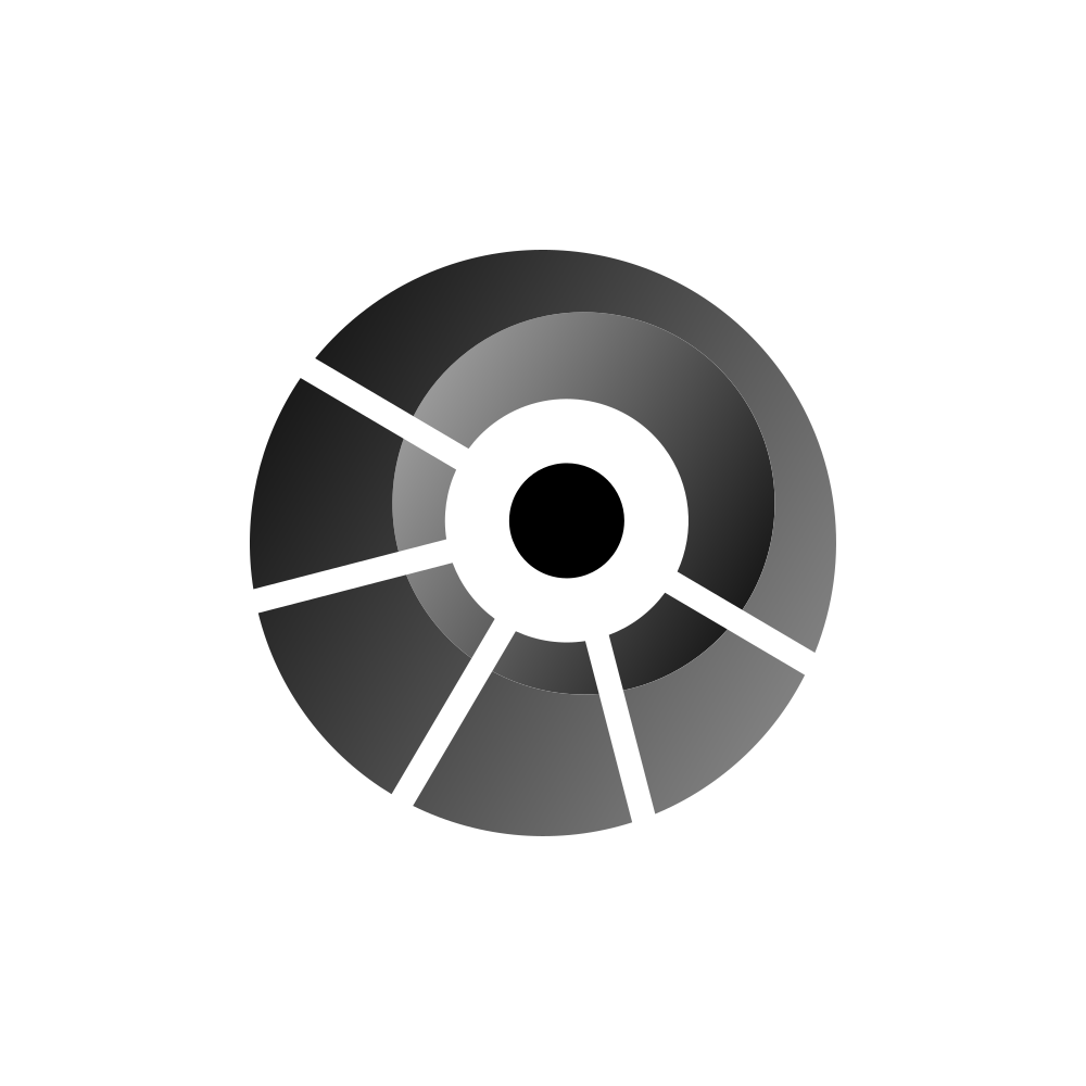
The mark ships in two colorways, dark for light surfaces and light for dark ones, plus circular badges and a full-bleed square built for avatars and app icons. Choose by background rather than by preference: the job of the colorway is contrast, and the light mark on a light surface disappears.
Every variant comes as an SVG and a 4167 px PNG. Use the SVG anywhere the size can change, print included, and keep the PNG for places that will not take vector art. Neither should be redrawn, recolored, or rebuilt from a screenshot.
Token art
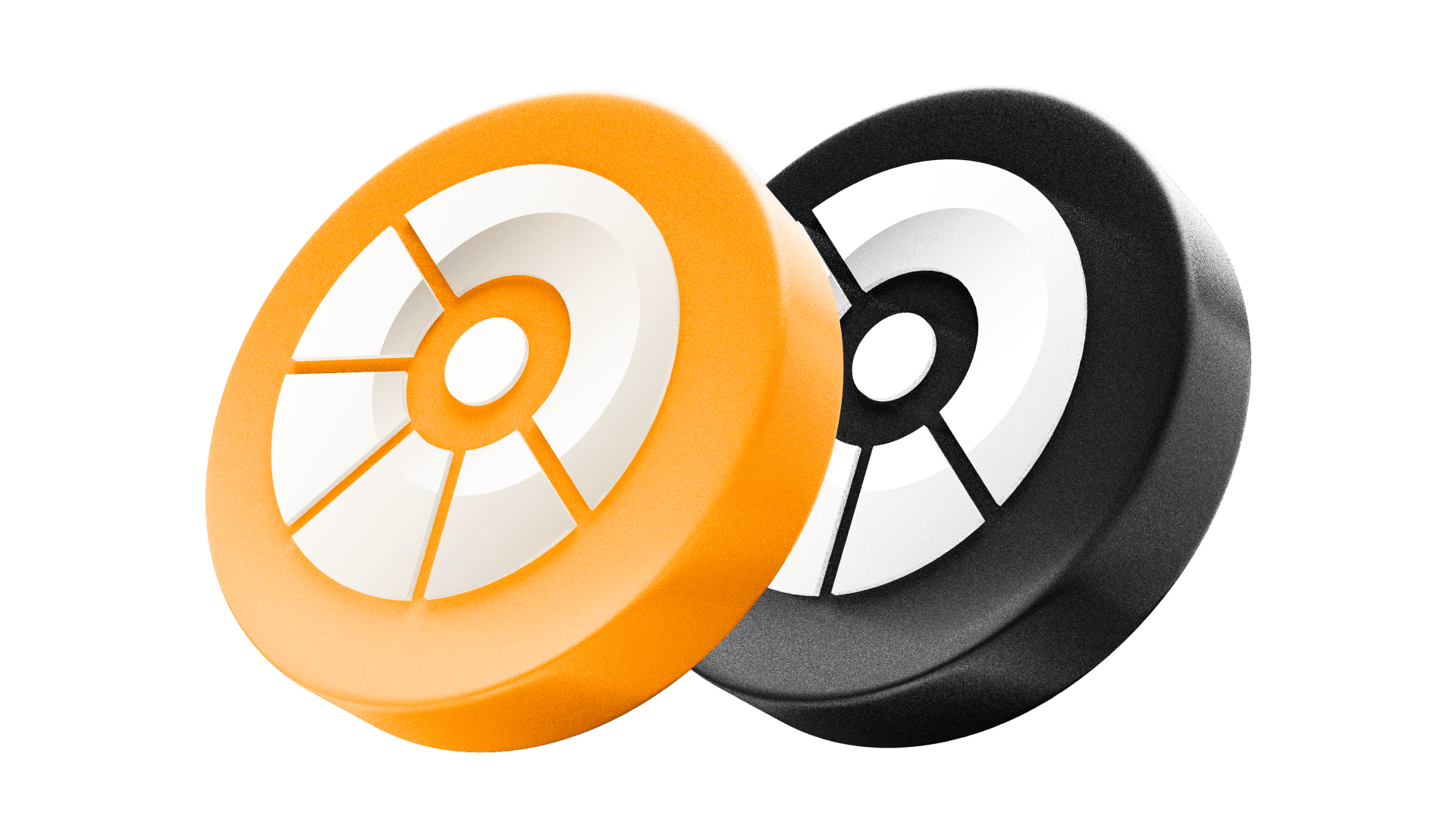
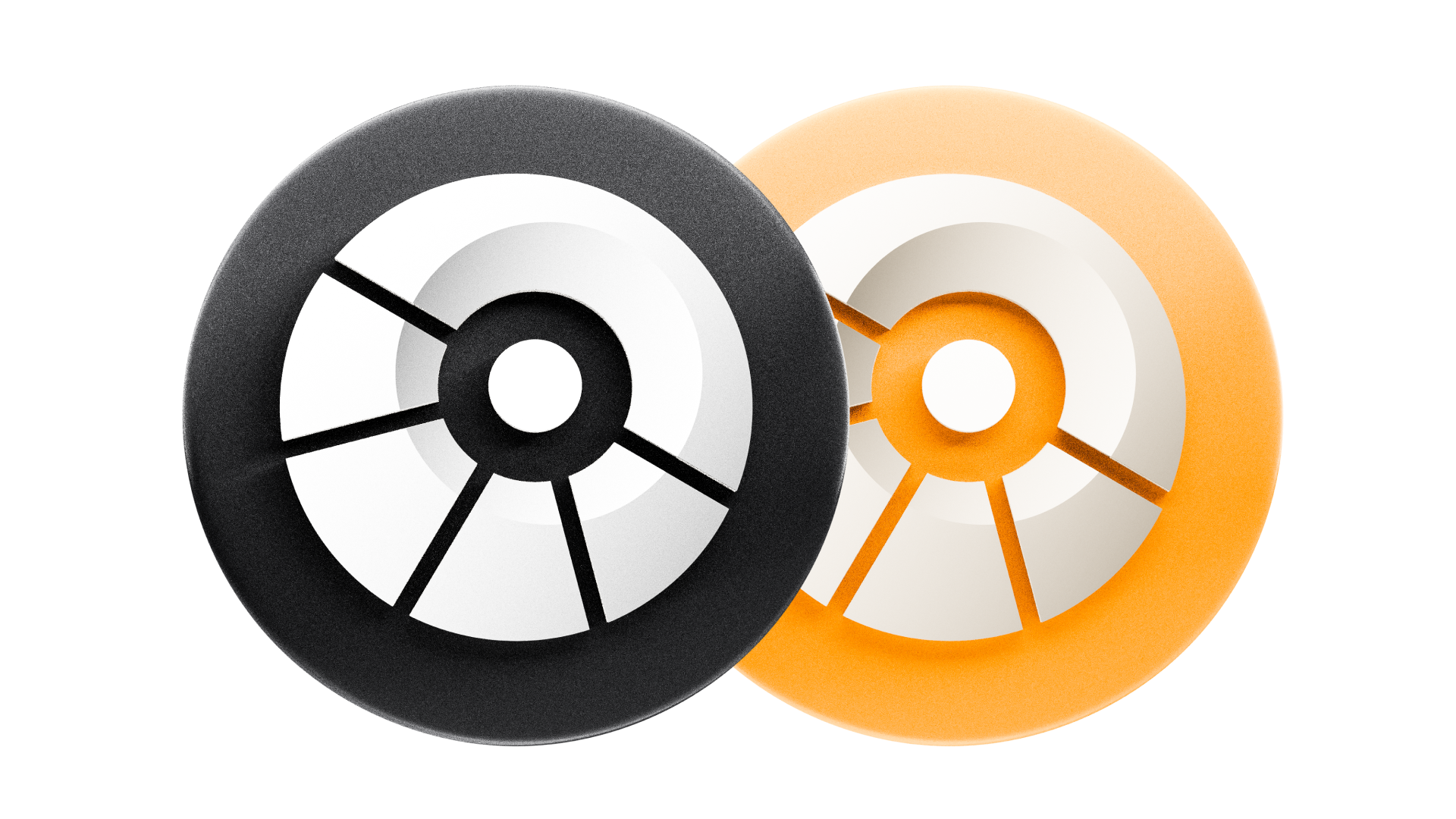
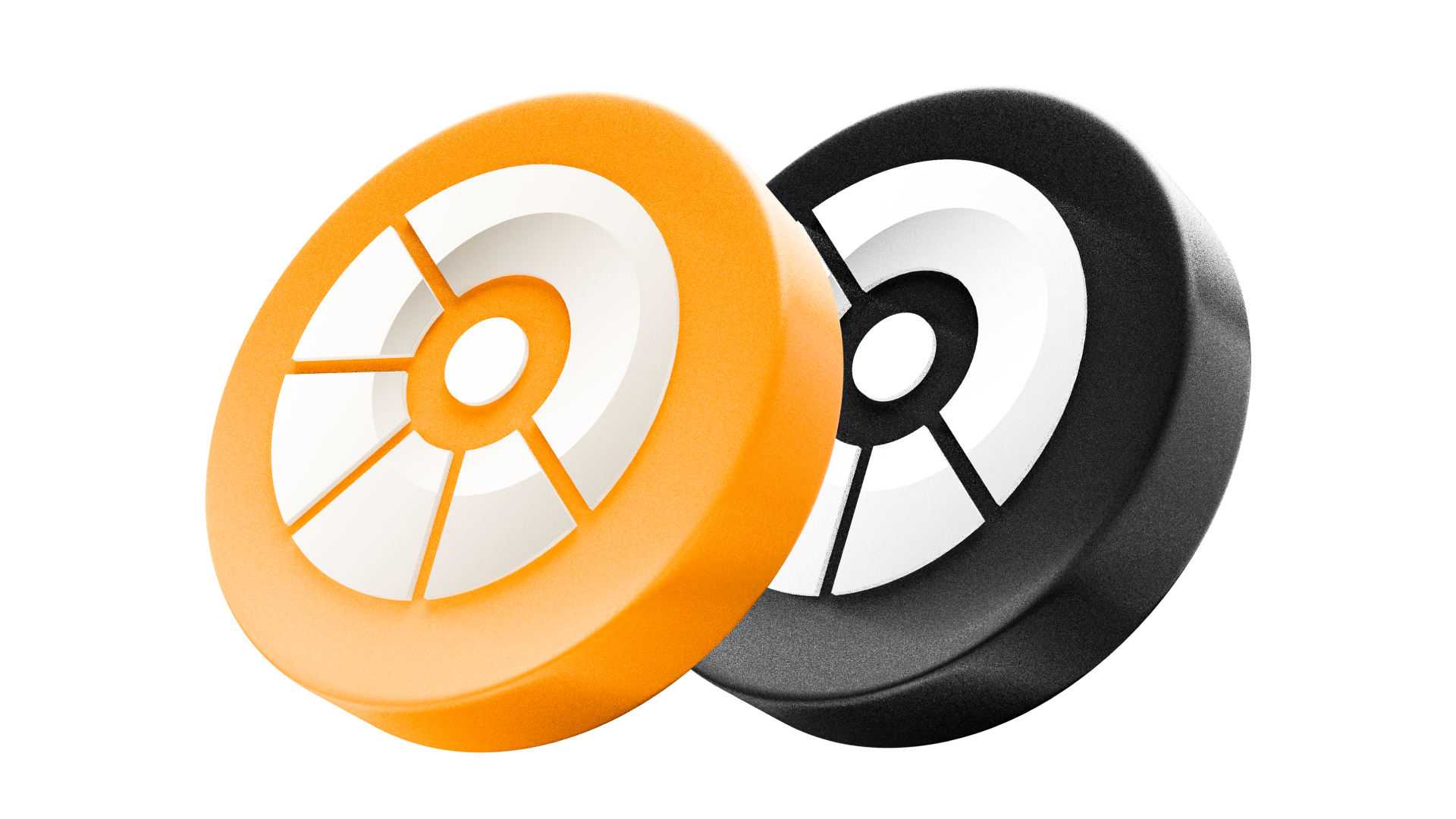
GYND is the black token and bGYND is the orange one, which is the fastest way to tell them apart at thumbnail size. The renders are high-resolution PNGs with transparent backgrounds, so they sit on any surface, and the paired images cover anywhere both tokens appear together. Keep the colors as they are: recoloring one token turns it into the other.

Colors
The palette is deliberately small. Ink and paper do most of the work, Bitcoin orange is the accent and is used sparingly so that it still registers, periwinkle is reserved for actions, and slate is the muted tone that sits beside them. Each swatch carries its hex value and a copy button.
Banners
Ready made headers for X and YouTube, each carrying the mark and the tagline at the size that platform expects. Use them as they are; if you need a different size, build it from the logo files above rather than rescaling a banner.


Usage
Two habits cover almost every case: use the original files, and give the mark room and contrast. The rest is detail.
- Use the provided files. Never redraw the mark.
- Pick the colorway that matches the background.
- Give the mark generous clear space on all sides.
- Keep contrast high; plain backgrounds work best.
- Recoloring the mark or changing its gradients.
- Stretching, rotating, or flipping it.
- Adding shadows, glows, outlines, or effects.
- Placing it over busy imagery or clashing colors.
- Typesetting “Gyndore” in another font as a lockup.
Downloads
Every asset above downloads on its own from the card it sits in, in each format it ships in. The media kit is that same set in a single zip, which is usually the faster option when you are setting up a press page or handing files to a designer.
Every logo, token render, and banner above, organized in one zip (~15 MB).
Media kit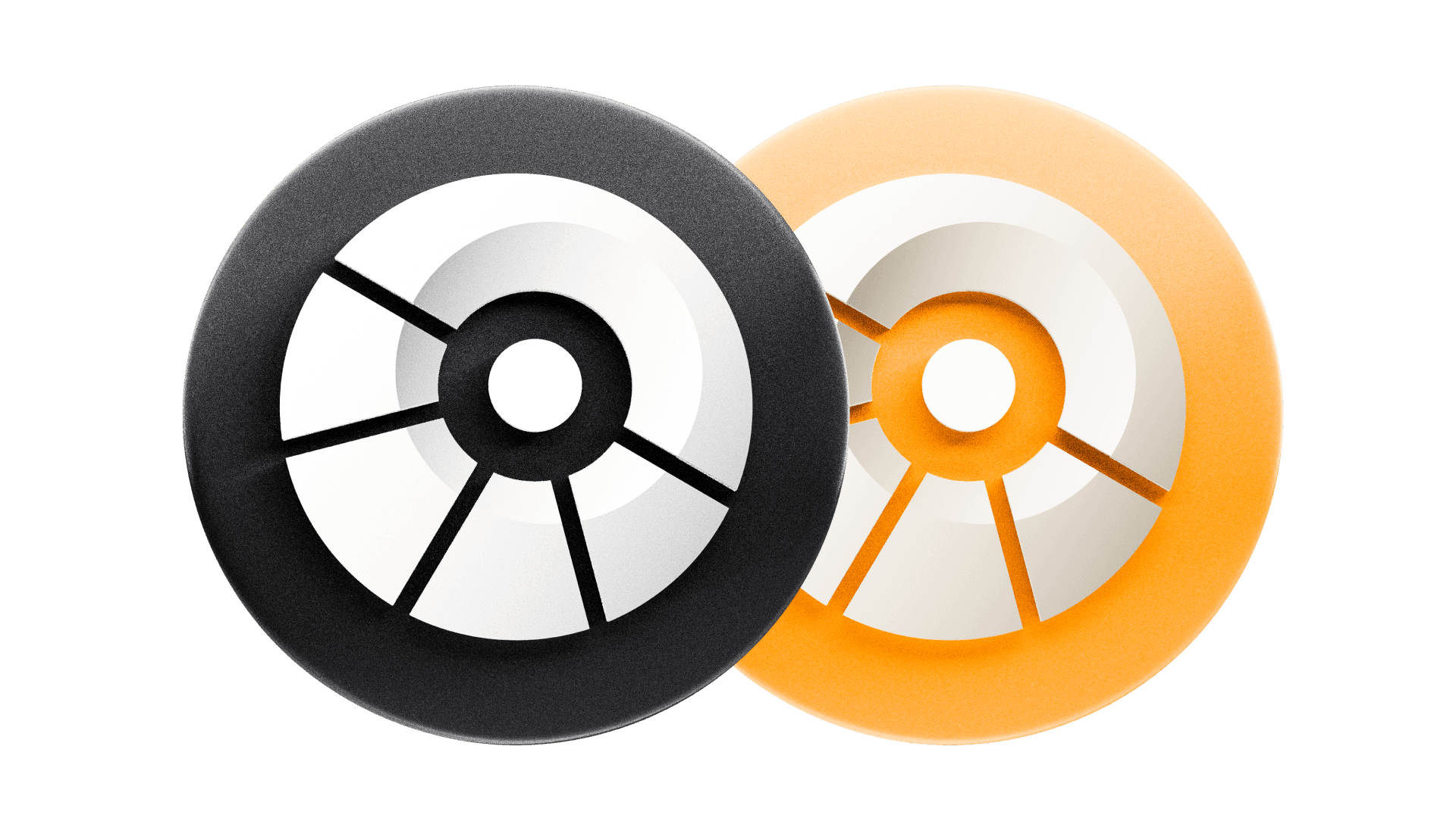
Frequently Asked Questions
Use the original, unmodified files from this page, keep the mark clearly visible, and give it generous space on all sides. Pick the colorway by background: the dark mark on light surfaces, the light mark on dark ones. For avatars and app icons, reach for a badge or the square instead of the full mark.
Yes. Articles, videos, integrations, and educational material are all welcome, as long as the usage does not misrepresent Gyndore or imply an endorsement, sponsorship, or partnership that does not exist. Don't alter the visual assets or combine them with other logos into a new lockup.
Original artwork that builds on the brand is encouraged, as long as the mark itself stays intact and the result still reads as Gyndore.